
Overview
A deliberate approach to a better interface.
- Problem
- A fitness brand homepage needs to create momentum quickly while still making classes, trainers, pricing, and contact paths easy to find.
- Solution
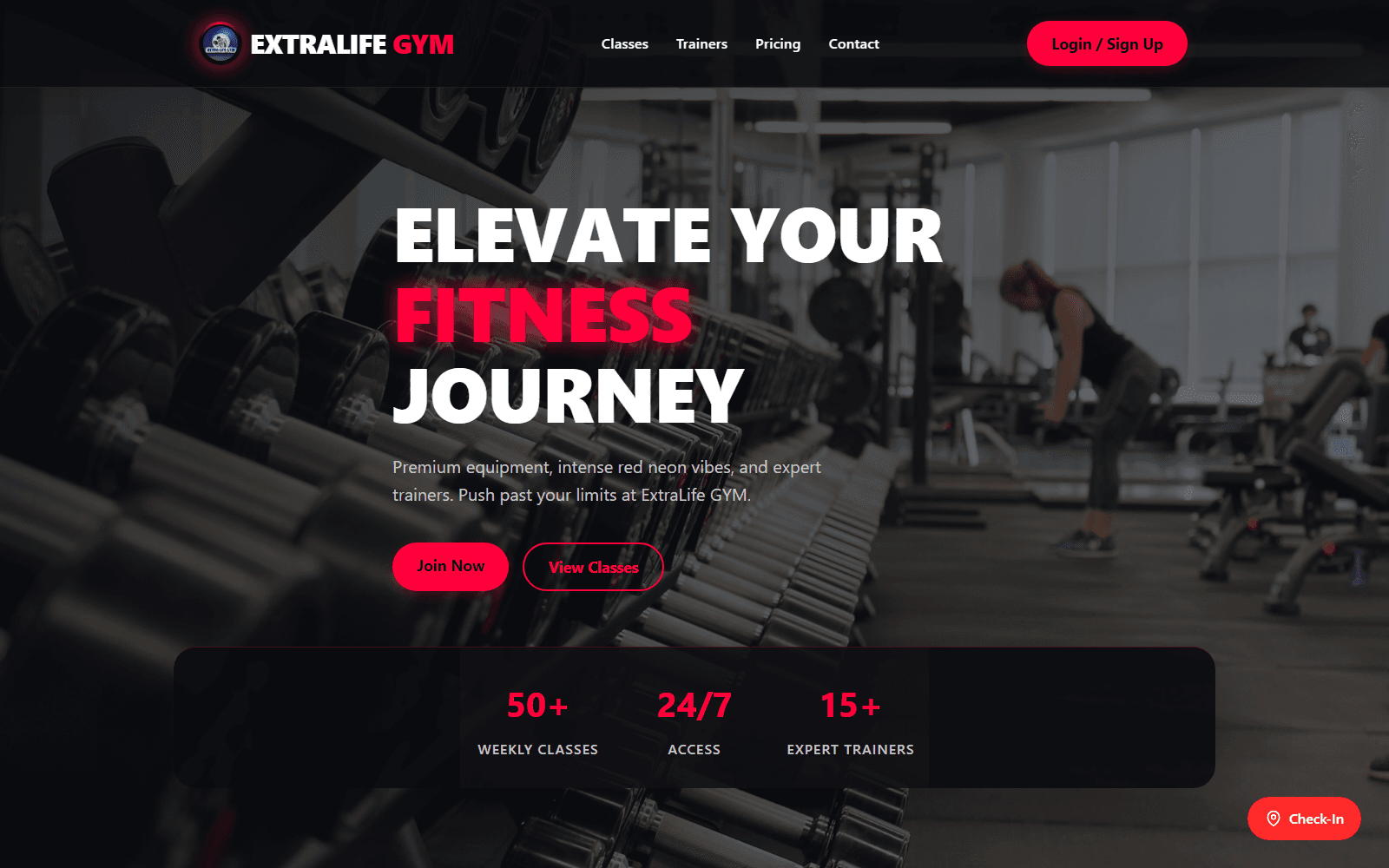
- Built a bold, responsive landing experience that combines strong fitness imagery, clear navigation, and direct membership calls to action.
- My role
- Frontend implementation, responsive UI, and visual interaction design.
- Timeline
- Independent build
- Team
- Independent
- Tech stack
- React, TypeScript, Vite, Vercel
Performance and quality snapshot
Targets established for a fast, accessible delivery
- Status
- Live
- Stack
- React
- Experience
- Responsive
- Code
- GitHub
public Vercel deployment
TypeScript frontend
fitness landing page
public repository
Design process
- Used the hero to establish the brand energy, then kept the primary navigation and conversion action visible.
- Organized the landing page around the information prospective members look for first: classes, trainers, pricing, and contact.
- Kept the red-on-charcoal visual system consistent across the navigation, actions, and supporting sections.
Architecture
- Built with React and TypeScript for a maintainable component-based frontend.
- Used Vite for a focused development workflow and Vercel for the live deployment.
- Structured the interface as reusable content sections so the brand can grow without rebuilding the core page.
Performance optimization
- Kept the primary membership action close to the hero rather than hiding it behind interaction-heavy UI.
- Used a focused landing-page structure to reduce the number of decisions required before a visitor can act.
- Deployed the project on Vercel for a reliable production delivery path.
Accessibility
- Used a clear navigation order for the core site areas and primary sign-up action.
- Kept foreground text and actions readable over the dark hero imagery.
- Designed the page hierarchy so content remains understandable without relying on imagery alone.
SEO
- Used descriptive section labels for classes, trainers, pricing, and contact.
- Kept the landing page copy focused on the gym offering and membership intent.
- Published the project as a public Vercel deployment for easy sharing and review.
Challenges
- Making a dense fitness offering feel energetic without overwhelming the primary conversion path.
- Balancing bold visual treatment with readable navigation and clear actions.
Results
- Status: Live (public Vercel deployment)
- Stack: React (TypeScript frontend)
- Experience: Responsive (fitness landing page)
- Code: GitHub (public repository)
Have a similar product challenge?
Let's turn the requirements into a resilient, high-performing interface.